
When a consumer takes to Twitter to post about a product or a brand, LikeFolio’s data-crunching tech captures their message in real time…
Cross-references the 10,767 brands in our database…
And checks for thousands of keywords to tell us whether or not that person spent their hard-earned cash.
But that’s just the start of what our consumer insights machine is capable of.
Our system can also reveal the most bullish and bearish opportunities in any given sector with one simple-but-powerful chart.
We call it the LikeFolio Outlier Grid – and it’s one of our favorite tools for identifying potential opportunities.
Today, we’re going to show you how the Outlier Grid sorts the winners from the losers in any given industry – and sums it up in one picture-perfect image…
How the LikeFolio Outlier Grid Reveals Winners and Losers at a Glance
The Outlier Grid you see below plots two key LikeFolio metrics against each other to reveal which stocks could be ready for liftoff:
- The x-axis (bottom) plots the growth rate of Purchase Intent (PI) Mentions: The further to the right, the faster consumer demand is growing for that company or brand.
- The y-axis (left) plots the percentage of positive social media mentions (aka Consumer Happiness): The higher a company or brand ranks, the happier their customers are.
In this Outlier Grid, we’ve plotted telehealth players Teladoc (TDOC), WW International (WW), and Hims & Hers (HIMS), which are all companies we’ve covered in-depth this week:
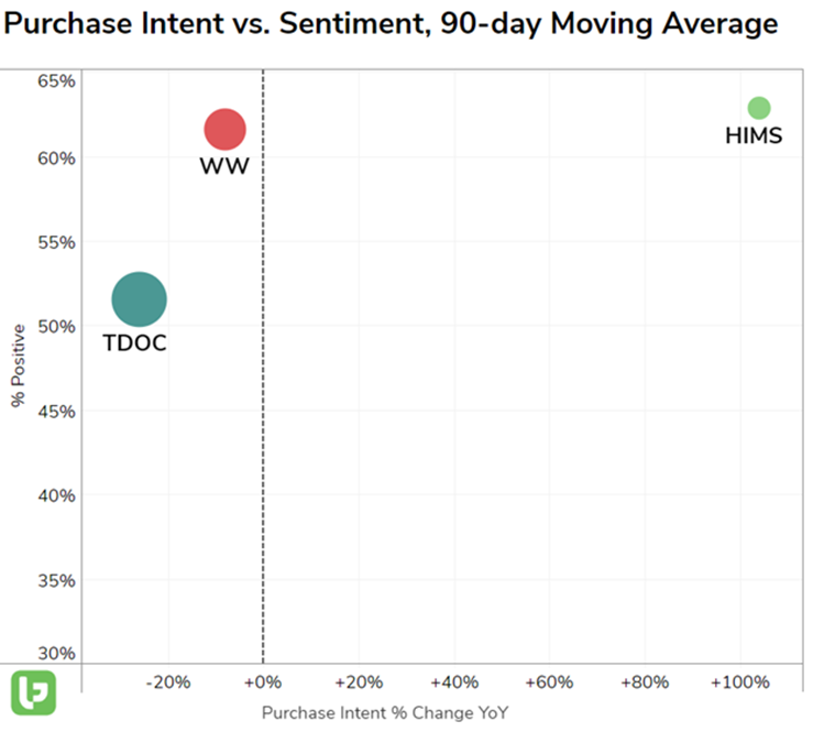
See TDOC in the lower-left corner? That’s the WORST place to be as a publicly-traded company. Because it means demand for its products and services is waning AND its customers are unhappy.
Now, notice HIMS in the upper-right corner: That’s the BEST position for a company to be in and where we find our most bullish opportunities.
When a company ends up in that upper-right spot, it means it’s outperforming competitors in every metric that matters to us, with higher demand growth and Consumer Happiness than its peers.
And when the size of that company’s dot is noticeably smaller than the others – well, that’s when we get really excited. Because the size reflects the total volume of social media mentions, which is a good indicator of the brand’s market penetration.
The smaller the dot, the more room there is left to grow – and the more customers still to acquire.
At a glance, this one chart illustrates just about everything you need to know about the opportunities in a given space.
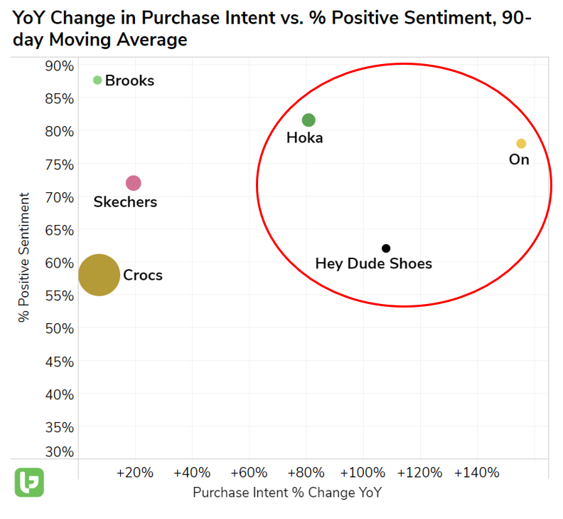
We used it to ID the three contenders that could unseat Crocs (CROX) as the king of comfy shoes:
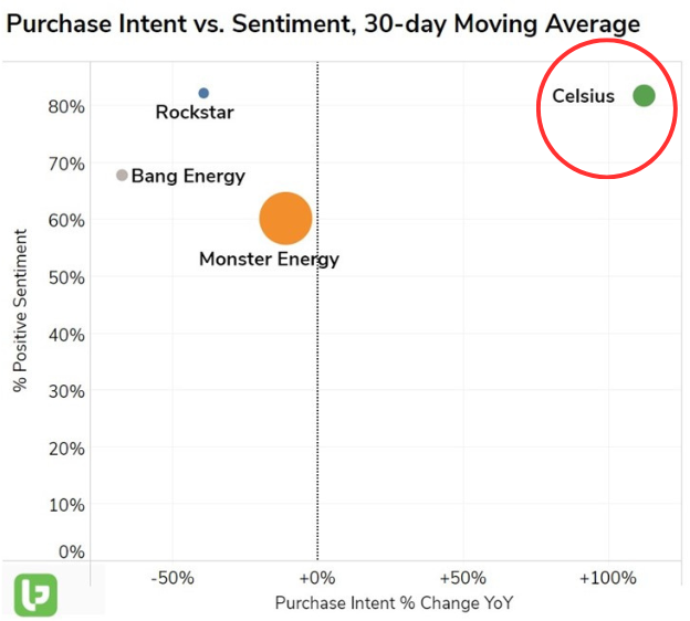
We used it to bring you Celsius (CELH) as the new reigning energy drink champ:
And we’ll use it next week to bring you even more lucrative opportunities, powered by LikeFolio’s unmatched consumer insights machine.
What investing sectors do you want to see the LikeFolio Outlier Grid reveal the winners and losers in? Send us a message at [email protected] to let us know, and you might see that Outlier Grid hit your inbox in the next few weeks.
All the best,

Megan Brantley
VP of Research

Continued Reading: Stock Picks: 50% Gains and Counting for This Telehealth Company in 2023 (And More Upside Ahead)
If you missed our coverage on Hims & Hers this week, make sure you check it out here. We think you’ll be impressed by this telehealth “underdog” and we’ll show you why.